The Add-to-Cart Bottleneck: Why High-Traffic Product Pages Fail to Convert in Malaysia
By Jetson, Head of CRO at ThriveX
Reading time: 6 minutes. Last updated: May 2026.
Author's Note:
Your product page is losing revenue that your ad spend already earned. Most PDP failures come down to six fixable elements: hero image quality, value proposition above the fold, social proof placement, trust signals near the buy button, sticky add-to-cart, and mobile thumb-friendly design. Fix these before you scale.
Lock in early access to the ThriveX AI Audit with Jetson for $49 before it goes to $99 at full launch.
The Real Problem Is Not Traffic
If you are spending $5K or more per month driving visitors to product pages and your add-to-cart (ATC) rate sits below 3%, you have a conversion problem, not an acquisition problem. The traffic is arriving. The page is losing it.
This is one of the most common patterns I see when working through the ThriveX CRO framework: founders interpret rising traffic as proof their marketing is working, then blame the product when sales do not follow. The real culprit is almost always the product detail page (PDP) itself.
A useful benchmark from Mida's 2026 ecommerce funnel research puts the average ATC rate at around 6.8%.
Below 2% is a clear signal that something on the page is creating friction at the decision moment.
What the Data Actually Shows
Baymard Institute's 2025 checkout usability research, based on a survey of 2,000+ US shoppers, names the top reasons people abandon before purchase. Two are directly within your control of the PDP.
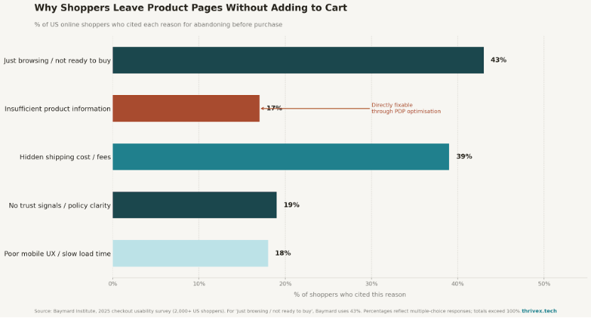
Top 5 reasons shoppers leave product pages without adding to cart. Source: Baymard Institute, 2025.
The most important number: 17% of shoppers leave because the page did not give them enough information to decide. That is nearly one in five lost conversions with nothing to do with your ad creative or pricing.
Only 49% of ecommerce sites have "decent" or better product page UX, and for mobile specifically, 62% of sites perform "mediocre" or worse.
The Six PDP Elements That Move ADD TO CART Rate
1. Hero Image Quality and Context
Your first image does more selling work than any headline. Baymard's research shows 42% of users actively try to judge product size from images, yet 37% of sites fail to provide in-scale images. For wearables, 23% of sites show no human model, making it impossible to evaluate fit. Use lifestyle images that show the product in real use. Each image should resolve a specific uncertainty.
2. Value Proposition Above the Fold
The hero section needs to answer three questions in under four seconds: What is this? Why does it solve my problem? Why should I trust it? Most PDPs waste above-the-fold space on decorative content. Move your strongest proof point up: a specific outcome ("ships in 24 hours, free returns"), a review snippet, or a concrete use-case statement. In mobile-first markets, the fold is shorter and the decision happens fast.
3. Social Proof Placement and Structure
Generic five-star reviews convert poorly. What converts is contextual proof. Baymard's user testing consistently shows shoppers look for reviews from people like them: same height, skin type, or use case. Structure your review form to collect context, then surface contextual reviews near the relevant variant selector. User-generated content showing real people using the product outperforms polished studio shots for exactly this reason.
4. Trust Signals Near the Buy Button
Baymard found that 44% of sites fail to display return policy from the main product page, and 15% of shoppers have abandoned purchases specifically because of an unsatisfactory or invisible return policy. Place these within visual proximity of your add-to-cart button:
Return policy summary ->(one line: "Free 30-day returns, no questions asked")
Shipping timeline-> ("Ships within 24 hours")
Security badge or payment trust mark
Live stock indicator ("Only 8 left" or "In stock, ready to ship")
Each signal reduces a specific fear. Combined, they can move ATC rate by several percentage points without touching your ad budget.
5. Sticky Add-to-Cart on Scroll
A shopper who scrolls to read reviews should never have to scroll back up to buy. A sticky ATC bar that follows scroll includes: product name, selected variant, price, and the add-to-cart button. Google's mobile performance data shows a one-second page load delay reduces conversions by up to 20%.
The same logic applies to scroll friction: every extra tap costs you conversions.
6. Mobile Thumb-Friendly Buttons
Button design is not cosmetic. Best practice for mobile PDPs: minimum 48px button height, full-width on small screens, and high contrast against the page background. Baymard testing found 57% of ecommerce sites still use dropdown menus for size selection rather than exposed selectors, which hide stock status until the user interacts.
Exposed size and color buttons with out-of-stock variants visually crossed out are significantly more conversion-friendly.
Diagnose Before You Redesign
Before rebuilding your PDP, run a quick diagnostic. Pull your analytics and check:
Scroll depth: Are shoppers reaching the ATC button at all?
Variant selector interactions: Which options are being engaged?
ATC rate by device: Is mobile more than 40% lower than desktop?
ATC rate by traffic source: Is paid traffic converting worse than organic?
If mobile ATC is significantly below desktop, the issue is almost certainly UX friction. If paid traffic underperforms organic, the problem may be message-to-page match: your ad promised something the page does not immediately confirm.
This is exactly where the ThriveX invisible friction AI audit surfaces problems that standard analytics miss.
What Comes Next in the Funnel
Fixing your PDP ATC rate is only step one. Once visitors add to cart, Baymard tracks the global average cart abandonment rate at 70.19%, meaning seven in ten who add to cart still do not buy. For the checkout friction playbook, read how to reduce cart abandonment rate.
If your PDP traffic is thin to begin with, top-of-funnel visibility may be the underlying issue. The AEO and Google AI Overviews guide covers how to get your product content surfaced at discovery before shoppers reach a competitor's page.
Get a CRO Audit with Jetson for $49
What you get. A full AI-powered audit of your product pages and conversion funnel, plus a 1:1 recommendation session with Jetson covering your highest-impact fixes.
Why now. Early access is $49. At full launch, it goes to $99.
Who it is for. DTC, B2B, and SaaS founders or marketing leads spending at least $5K per month on paid media, or planning to scale.
Book it here. Lock in early access at $49 before it goes to $99.
Further Reading in the ThriveX Knowledge Hub
Why you need CRO before you scale ads: The case for fixing conversion before pouring more budget into paid acquisition.
How to reduce cart abandonment rate: What to fix in checkout once your PDP ATC rate is healthy.
The invisible friction AI audit: How AI-powered diagnostics catch friction points standard analytics miss.
The Marketing Visibility Problem: Getting discovered at the top of the funnel before shoppers find your competitors.
Why ads waste money with an unclear funnel: The structural reason ad spend fails when the conversion system is broken.
Product Page Questions That Decide the Sale
Why do high-traffic product pages fail to convert?
High-traffic product pages fail to convert when visitors do not get enough clarity, trust, or motivation to add to cart. The issue is usually not traffic. It is friction on the product page: weak hero images, unclear value proposition, missing reviews, poor mobile layout, hidden trust signals, or a hard-to-use add-to-cart button.
What product page elements improve add-to-cart rate?
The highest-impact product page elements are strong hero images, clear above-the-fold value proposition, contextual reviews, trust signals near the buy button, sticky add-to-cart, and mobile thumb-friendly buttons. These elements help shoppers understand the product, trust the brand, and take action without extra hesitation.
What is a good add-to-cart rate for ecommerce product pages?
A healthy add-to-cart rate depends on the industry, traffic quality, product price, and device mix. As a simple benchmark, ecommerce brands should investigate product pages with add-to-cart rates below 3%. If traffic is strong but add-to-cart rate is weak, the product detail page is likely creating friction at the decision point.
Frequently asked questions
What is a good add-to-cart rate for ecommerce?
Around 6.8% on average (Mida, 2026). Below 2% signals a PDP or offers clarity problems.
Why do shoppers leave product pages without adding to cart?
Top fixable reasons per Baymard 2025: hidden shipping costs (39%), no trust signals (19%), poor mobile UX (18%), insufficient product information (17%).
How do I increase my add-to-cart rate without more ad spend?
Fix the six PDP elements: hero images, above-fold value prop, contextual social proof, trust signals near CTA, sticky ATC bar, thumb-friendly buttons.
What size should the add-to-cart button be on mobile?
Minimum 44 to 48px touch target height, full-width on small screens, high contrast against background.
Should I show my return policy on the product page?
Yes. Baymard found 44% of sites fail to do this and 15% of shoppers have abandoned due to an invisible return policy.
What is a sticky add-to-cart bar?
A persistent UI element that keeps the product name, variant, price, and CTA visible as the shopper scrolls down the page.